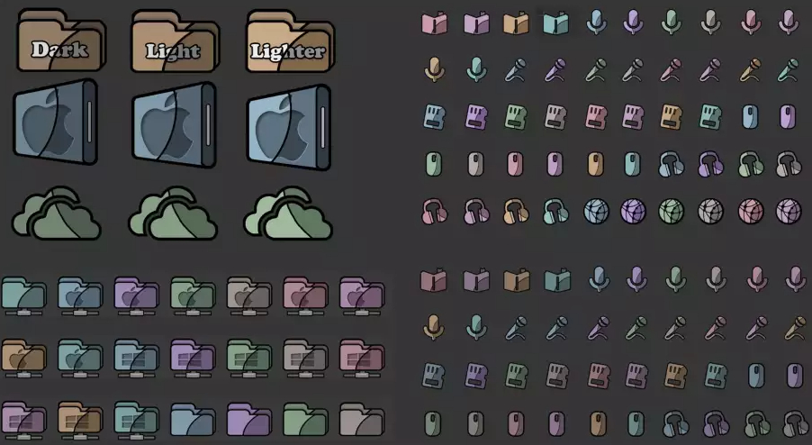
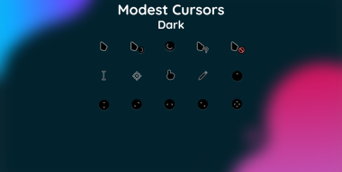
1. Dark-Original (Темный оригинал):
Этот вариант иконок олицетворяет элегантность и загадочность. Темные оттенки и мягкие контуры создают атмосферу таинственности и стиля. Каждая иконка в этом наборе выглядит элегантно и привлекательно на фоне глубокого темного фона.
2. Light (Светлый):
Светлый вариант иконок придает радостное и свежее настроение вашему рабочему столу. Яркие цвета и четкие линии делают каждую иконку различимой и легко узнаваемой. Он создает ощущение легкости и простоты в использовании.
3. Lighter (Светлее):
Вариант Lighter добавляет еще больше света и воздушности в ваш интерфейс Windows. Эти иконки имеют более яркие цвета и минималистичный дизайн, который придает им современный и стильный вид. Они напоминают о чистоте и простоте форм.
Каждый из этих трех вариантов значков, хотя и отличается по цветовой гамме, сохраняет общий стиль, что позволяет им гармонично сочетаться между собой на вашем рабочем столе, надеюсь, это описание поможет вам представить, как будут выглядеть эти наборы иконок на вашем компьютере. Если у вас есть какие-либо другие пожелания или вопросы, не стесняйтесь спрашивать в комментариях или на форуме.
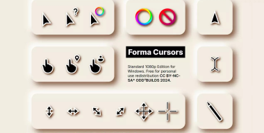
The icon set for Windows - 8 flavours, consists of three options (Dark-Original, Light, Lighter), made in the same style:
1. Dark-Original:
This icon variant represents elegance and mystery. Dark shades and soft contours create an atmosphere of mystery and style. Each icon in this set looks elegant and attractive against a deep, dark background.
2. Light:
The light version of the icons gives a joyful and fresh mood to your desktop. Vibrant colors and clean lines make each icon distinct and easy to recognize. It creates a feeling of lightness and ease of use.
3. Lighter:
The Lighter option adds even more light and airiness to your Windows interface. These icons have brighter colors and a minimalistic design that gives them a modern and stylish look. They remind us of the purity and simplicity of forms.
Each of these three icon options, although different in color scheme, maintains a common style that allows them to blend harmoniously on your desktop, I hope this description will help you imagine what these icon sets will look like on your computer. If you have any other requests or questions, feel free to ask in the comments or on the forum.
-
Das Icon-Set für Windows 8 besteht aus drei Optionen (Dunkel-Original, Hell, Heller), die im gleichen Stil gestaltet sind:
1. Dunkel-Original:
Diese Icon-Variante steht für Eleganz und Geheimnis. Dunkle Farbtöne und weiche Konturen schaffen eine Atmosphäre voller Geheimnis und Stil. Jedes Symbol in diesem Set sieht vor einem tiefen, dunklen Hintergrund elegant und attraktiv aus.
2. Licht:
Die Light-Version der Symbole verleiht Ihrem Desktop eine fröhliche und frische Stimmung. Lebendige Farben und klare Linien machen jedes Symbol unverwechselbar und leicht zu erkennen. Es erzeugt ein Gefühl von Leichtigkeit und Benutzerfreundlichkeit.
3. Feuerzeug:
Die Option „Heller“ verleiht Ihrer Windows-Oberfläche noch mehr Licht und Luftigkeit. Diese Symbole haben hellere Farben und ein minimalistisches Design, das ihnen ein modernes und stilvolles Aussehen verleiht. Sie erinnern uns an die Reinheit und Einfachheit der Formen.
Obwohl sich jede dieser drei Symboloptionen im Farbschema unterscheidet, behält sie einen gemeinsamen Stil bei, der es ihnen ermöglicht, sich harmonisch auf Ihren Desktop einzufügen. Ich hoffe, diese Beschreibung hilft Ihnen dabei, sich vorzustellen, wie diese Symbolsätze auf Ihrem Computer aussehen werden. Wenn Sie weitere Wünsche oder Fragen haben, können Sie diese gerne in den Kommentaren oder im Forum stellen.
-
Le jeu d'icônes pour Windows - 8 versions, se compose de trois options (Dark-Original, Light, Lighter), réalisées dans le même style:
1. Sombre-Original:
Cette variante d'icône représente l'élégance et le mystère. Les nuances sombres et les contours doux créent une atmosphère de mystère et de style. Chaque icône de cet ensemble est élégante et attrayante sur un fond profond et sombre.
2. Lumière:
La version légère des icônes donne une ambiance joyeuse et fraîche à votre bureau. Des couleurs vives et des lignes épurées rendent chaque icône distincte et facile à reconnaître. Cela crée une sensation de légèreté et de facilité d’utilisation.
3. Briquet :
L'option Plus clair ajoute encore plus de lumière et de légèreté à votre interface Windows. Ces icônes ont des couleurs plus vives et un design minimaliste qui leur donne un look moderne et élégant. Ils nous rappellent la pureté et la simplicité des formes.
Chacune de ces trois options d'icônes, bien que différentes dans leur palette de couleurs, conservent un style commun qui leur permet de se fondre harmonieusement sur votre bureau. J'espère que cette description vous aidera à imaginer à quoi ressembleront ces jeux d'icônes sur votre ordinateur. Si vous avez d'autres demandes ou questions, n'hésitez pas à les poser dans les commentaires ou sur le forum.
-
El conjunto de iconos para Windows - 8 versiones consta de tres opciones (Oscuro-Original, Claro, Más claro), realizadas en el mismo estilo:
1. Original oscuro:
Esta variante de ícono representa elegancia y misterio. Los tonos oscuros y los contornos suaves crean una atmósfera de misterio y estilo. Cada ícono de este conjunto luce elegante y atractivo sobre un fondo oscuro y profundo.
2. Luz:
La versión ligera de los íconos le da un ambiente alegre y fresco a su escritorio. Los colores vibrantes y las líneas limpias hacen que cada ícono sea distinto y fácil de reconocer. Crea una sensación de ligereza y facilidad de uso.
3. Encendedor:
La opción Más clara agrega aún más luminosidad y amplitud a su interfaz de Windows. Estos íconos tienen colores más brillantes y un diseño minimalista que les da un aspecto moderno y elegante. Nos recuerdan la pureza y sencillez de las formas.
Cada una de estas tres opciones de iconos, aunque difieren en combinación de colores, mantiene un estilo común que les permite combinarse armoniosamente en su escritorio. Espero que esta descripción le ayude a imaginar cómo se verán estos conjuntos de iconos en su computadora. Si tiene alguna otra solicitud o pregunta, no dude en preguntar en los comentarios o en el foro.
-
Windows - 8 版本的图标集由三个选项组成(深色-原始、浅色、浅色),风格相同:
1. 黑暗原版:
这个图标变体代表着优雅和神秘。 深色色调和柔和的轮廓营造出神秘而时尚的氛围。 该集中的每个图标在深邃、黑暗的背景下看起来优雅且有吸引力。
2. 光:
浅色版本的图标给您的桌面带来欢乐和新鲜的气氛。 鲜艳的色彩和简洁的线条使每个图标独特且易于识别。 它营造出一种轻盈且易于使用的感觉。
3.打火机:
“打火机”选项为您的 Windows 界面增添了更多的亮度和空气感。 这些图标具有更明亮的颜色和简约的设计,赋予它们现代时尚的外观。 它们提醒我们形式的纯粹性和简单性。
这三个图标选项虽然配色方案不同,但都保持了共同的风格,使它们能够在您的桌面上和谐地融合在一起,我希望这个描述能够帮助您想象这些图标集在您的计算机上的样子。 如果您有任何其他请求或问题,请随时在评论或论坛中提问。
-
Windows 8 버전용 아이콘 세트는 동일한 스타일로 만들어진 세 가지 옵션(Dark-Original, Light, Lighter)으로 구성됩니다.
1. 다크 원본:
이 아이콘 변형은 우아함과 신비로움을 나타냅니다. 어두운 색조와 부드러운 윤곽이 신비로운 분위기와 스타일을 연출합니다. 이 세트의 각 아이콘은 깊고 어두운 배경에 비해 우아하고 매력적으로 보입니다.
2. 빛:
아이콘의 라이트 버전은 데스크탑에 즐겁고 신선한 분위기를 선사합니다. 생생한 색상과 깔끔한 선으로 각 아이콘이 뚜렷하고 쉽게 인식됩니다. 가벼움과 사용 편의성을 제공합니다.
3. 라이터:
라이터 옵션은 Windows 인터페이스에 훨씬 더 가볍고 경쾌한 느낌을 더합니다. 이 아이콘은 더 밝은 색상과 미니멀한 디자인으로 현대적이고 세련된 느낌을 줍니다. 이는 형태의 순수함과 단순함을 상기시켜 줍니다.
이 세 가지 아이콘 옵션은 각각 색 구성표는 다르지만 데스크탑에서 조화롭게 혼합될 수 있는 공통 스타일을 유지합니다. 이 설명이 이러한 아이콘 세트가 컴퓨터에서 어떻게 보일지 상상하는 데 도움이 되기를 바랍니다. 그 외 요청사항이나 질문이 있으시면 댓글이나 포럼을 통해 편하게 질문해주세요.