Белый указатель с интенсивной синей окантовкой смотрится очень интересно и необычно, цветовое сочетание белого и синего напоминающее молоко, придаёт указателю особую привлекательность и интересный внешний вид, явно автор, позиционировал свою работу именно таким образом, наверняка стремился вызвать ассоциации с чем-то свежим, чистым и комфортным. Простая форма курсора, без излишеств, делает его универсальным и удобным в использовании, такой дизайн хорошо подойдет для персонализации интерфейса, особенно если он будет использоваться на светлом оформлении, кроме того, синяя окантовка выделяет указатель и делает его более заметным на экране. В целом, такие курсоры будут отличным дополнением для стилизации интерфейса и добавят элемент оригинальности и стиля с их помощью можно не только усовершенствовать внешний вид рабочего стола, но и создать уникальный и запоминающийся образ системы в целом.
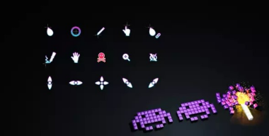
The white pointer with an intense blue border looks very interesting and unusual, the color combination of white and blue, reminiscent of milk, gives the pointer a special attractiveness and interesting appearance, clearly the author positioned his work in this way, probably trying to evoke associations with something fresh, clean and comfortable. The simple shape of the cursor, without frills, makes it universal and easy to use; this design is well suited for personalizing the interface, especially if it is used on a light design; in addition, the blue border highlights the pointer and makes it more visible on the screen. In general, such cursors will be an excellent addition to styling the interface and will add an element of originality and style. With their help, you can not only improve the appearance of your desktop, but also create a unique and memorable image of the system as a whole.
Der weiße Zeiger mit einem intensiv blauen Rand sieht sehr interessant und ungewöhnlich aus, die Farbkombination von Weiß und Blau, die an Milch erinnert, verleiht dem Zeiger eine besondere Attraktivität und ein interessantes Aussehen, offensichtlich hat der Autor sein Werk auf diese Weise positioniert und wahrscheinlich versucht, zu evozieren Assoziationen mit etwas Frischem, Sauberem und Bequemem. Die schlichte Form des Cursors ohne Schnörkel macht ihn universell und einfach zu verwenden. Dieses Design eignet sich gut zur Personalisierung der Benutzeroberfläche, insbesondere wenn es auf einem hellen Design verwendet wird besser auf dem Bildschirm sichtbar. Im Allgemeinen sind solche Cursor eine hervorragende Ergänzung zum Design der Benutzeroberfläche und verleihen ihr ein originelles und stilvolles Element. Mit ihrer Hilfe können Sie nicht nur das Erscheinungsbild Ihres Desktops verbessern, sondern auch ein einzigartiges und einprägsames Bild des Systems erstellen als Ganzes.
Le pointeur blanc avec une bordure bleue intense semble très intéressant et inhabituel, la combinaison de couleurs blanc et bleu, rappelant le lait, donne au pointeur un attrait particulier et une apparence intéressante, il est clair que l'auteur a positionné son œuvre de cette manière, essayant probablement d'évoquer associations avec quelque chose de frais, propre et confortable. La forme simple du curseur, sans fioritures, le rend universel et facile à utiliser ce design est bien adapté pour personnaliser l'interface, surtout s'il est utilisé sur un design clair. De plus, la bordure bleue met en valeur le pointeur et le rend plus visible plus visible à l'écran. En général, de tels curseurs constitueront un excellent ajout au style de l'interface et ajouteront un élément d'originalité et de style. Avec leur aide, vous pourrez non seulement améliorer l'apparence de votre bureau, mais également créer une image unique et mémorable du système. dans son ensemble.
El puntero blanco con un borde azul intenso se ve muy interesante e inusual, la combinación de colores blanco y azul, que recuerda a la leche, le da al puntero un atractivo especial y una apariencia interesante, claramente el autor posicionó su trabajo de esta manera, probablemente tratando de evocar asociaciones con algo fresco, limpio y cómodo. La forma simple del cursor, sin adornos, lo hace universal y fácil de usar; este diseño es muy adecuado para personalizar la interfaz, especialmente si se usa en un diseño ligero; además, el borde azul resalta el puntero y lo hace; más visible en la pantalla. En general, estos cursores serán una excelente adición al estilo de la interfaz y agregarán un elemento de originalidad y estilo. Con su ayuda, no solo podrá mejorar la apariencia de su escritorio, sino también crear una imagen única y memorable del sistema. como un todo.
白色的指针搭配强烈的蓝色边框,看起来非常有趣和不寻常,白色和蓝色的颜色组合,让人想起牛奶,赋予指针一种特殊的吸引力和有趣的外观,显然作者这样定位他的作品,可能是想唤起人们的兴趣。与新鲜、干净和舒适的事物有关。 光标的形状简单,没有多余的装饰,使其通用且易于使用;这种设计非常适合个性化界面,尤其是在浅色设计上使用时,此外,蓝色边框突出了指针并使其更加突出。在屏幕上更明显。 一般来说,这样的光标将是界面样式的绝佳补充,并且会添加原创性和风格的元素,在它们的帮助下,您不仅可以改善桌面的外观,还可以创建独特且令人难忘的系统图像。作为一个整体。
강렬한 파란색 테두리가 있는 흰색 포인터는 매우 흥미롭고 특이해 보입니다. 우유를 연상시키는 흰색과 파란색의 색상 조합은 포인터에 특별한 매력과 흥미로운 모습을 제공합니다. 분명히 저자는 자신의 작업을 이러한 방식으로 배치하여 신선하고 깨끗하며 편안한 것과의 연관성. 주름이 없는 단순한 모양의 커서는 보편적이고 사용하기 쉽습니다. 이 디자인은 인터페이스를 개인화하는 데 적합합니다. 특히 밝은 디자인에 사용하는 경우 파란색 테두리가 포인터를 강조 표시합니다. 화면에 더 잘 보입니다. 일반적으로 이러한 커서는 인터페이스 스타일링에 탁월한 추가 기능을 제공하며 독창성과 스타일 요소를 추가하여 데스크탑의 모양을 개선할 수 있을 뿐만 아니라 독특하고 기억에 남는 시스템 이미지를 만들 수 있습니다. 전체적으로.